Color Usage
Vietnam Is Awesome is a diverse community with various activities and chapters for all age groups. The color system should stay recognizable while being flexible enough to adapt to different designs and applications.
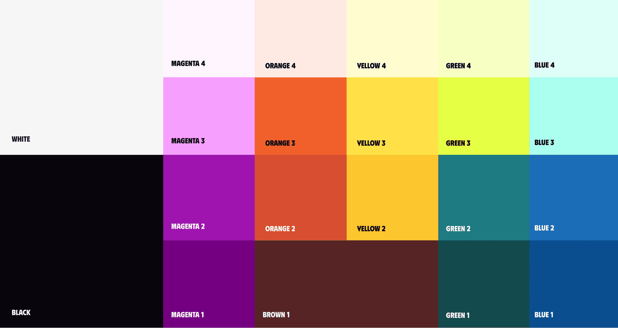
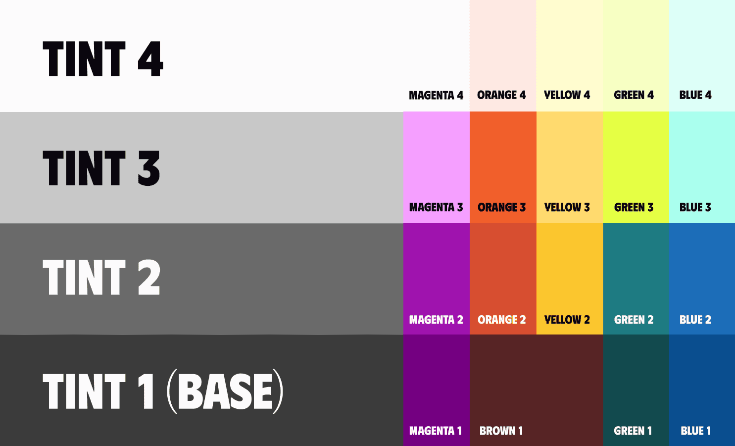
4 Tint Levels
From the four main colours, separate them into different tint levels with increasing values. The darkest colours are Tint 1, and the lightest colours are Tint 4.
4 Ways To Mix Colors
There are four ways to combine tints according to different moods and situations: Monotone, Dynamic, Light Monotone, and Light Dynamic.
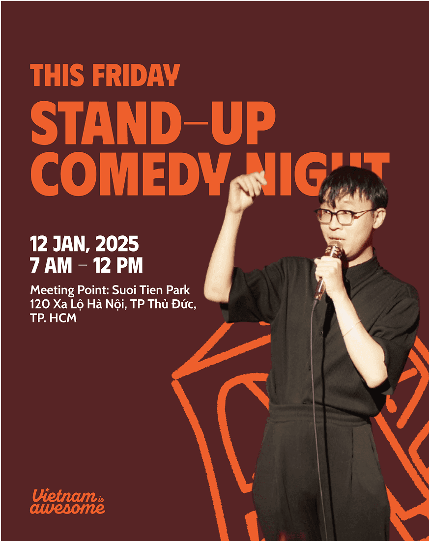
Monotone Theme
This colour scheme uses pairs of the same hue to create a calm and neutral feel.
Use a background colour from Tint 1 or Tint 2 with a headline in the same hue, like Magenta 1 paired with Magenta 3, ensuring sufficient contrast between the text and background. The body text should be white.

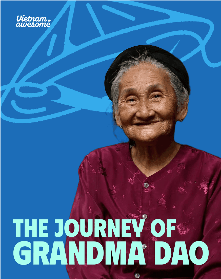
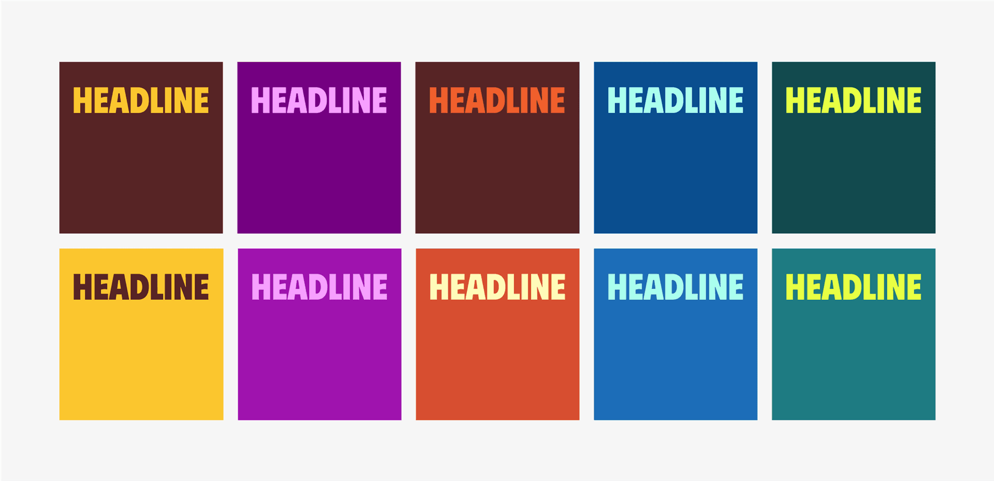
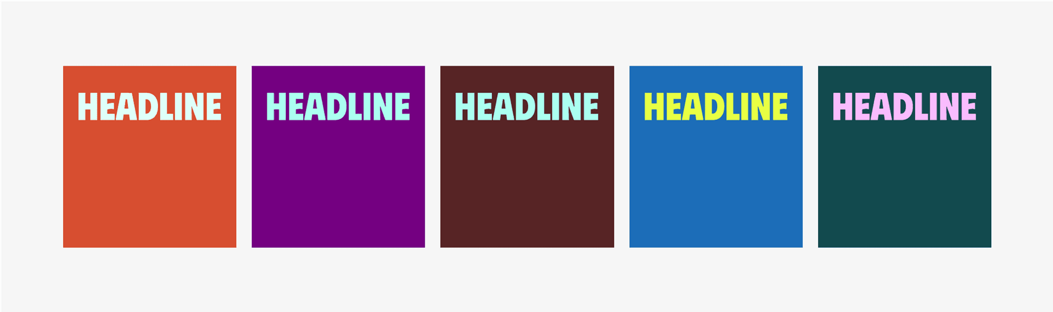
Dynamic Theme
This colour scheme uses pairs of different hues to create a bold and dynamic feel.
Body text should use white.Use a background colour from Tint 1 or 2 with a headline in the same hue, like Green 1 paired with Magenta 3, ensuring sufficient contrast between the text and background. The body text should be white.
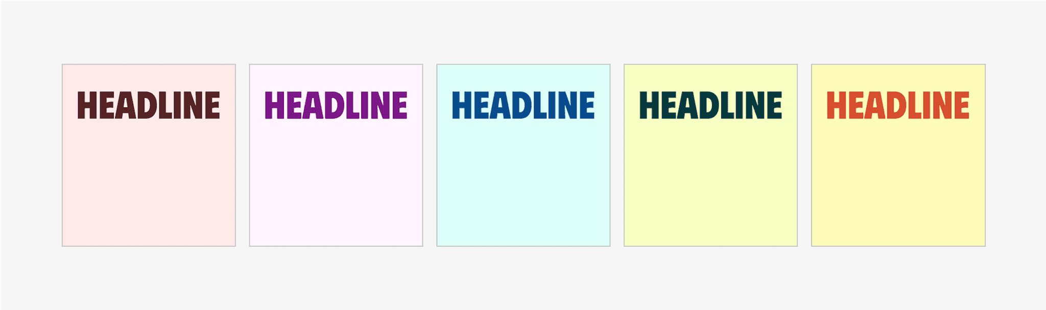
Light Monotone Theme
This colour scheme uses pairs of the same hue to create a calm and neutral feel.
Use a background colour from Tint 4 with a headline in the same hue, like Magenta 4 paired with Magenta 1, ensuring sufficient contrast between the text and background. The body text should be black.

Light Dynamic Theme
This colour scheme uses pairs of different hues to create a bold and dynamic feel.
Use a background colour from Tint 4 with a headline in the different hue, like Magenta 4 paired with Magenta 1, ensuring sufficient contrast between the text and background. The body text should be black.


Examples
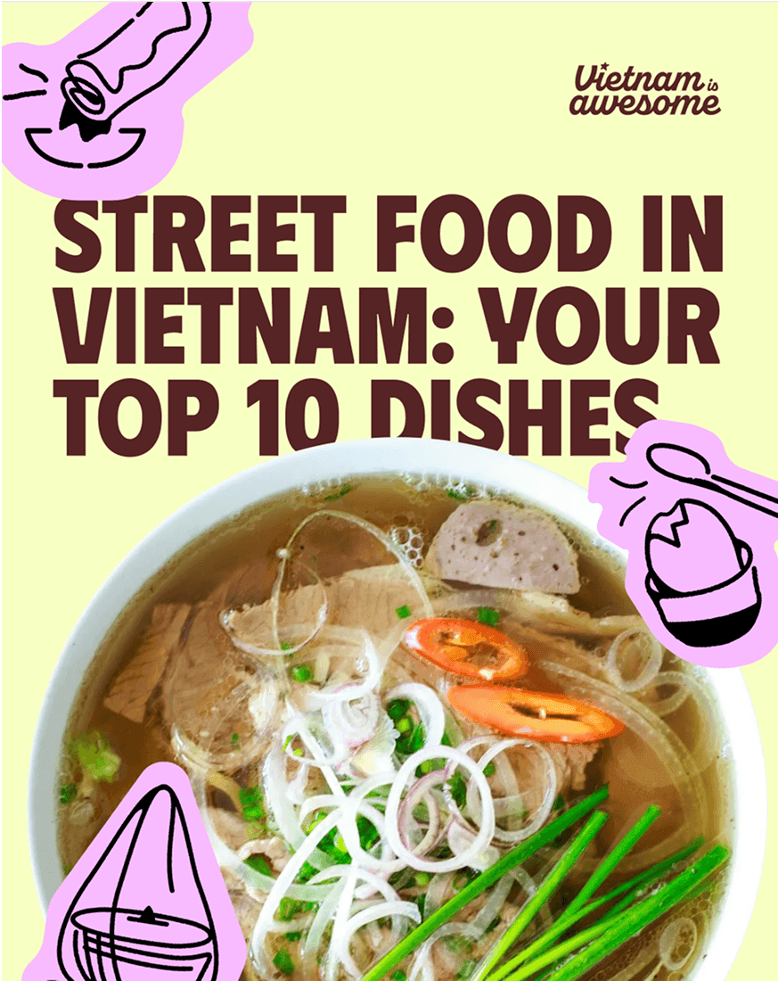
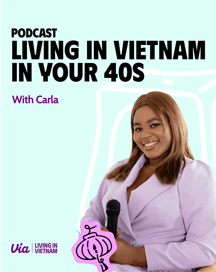
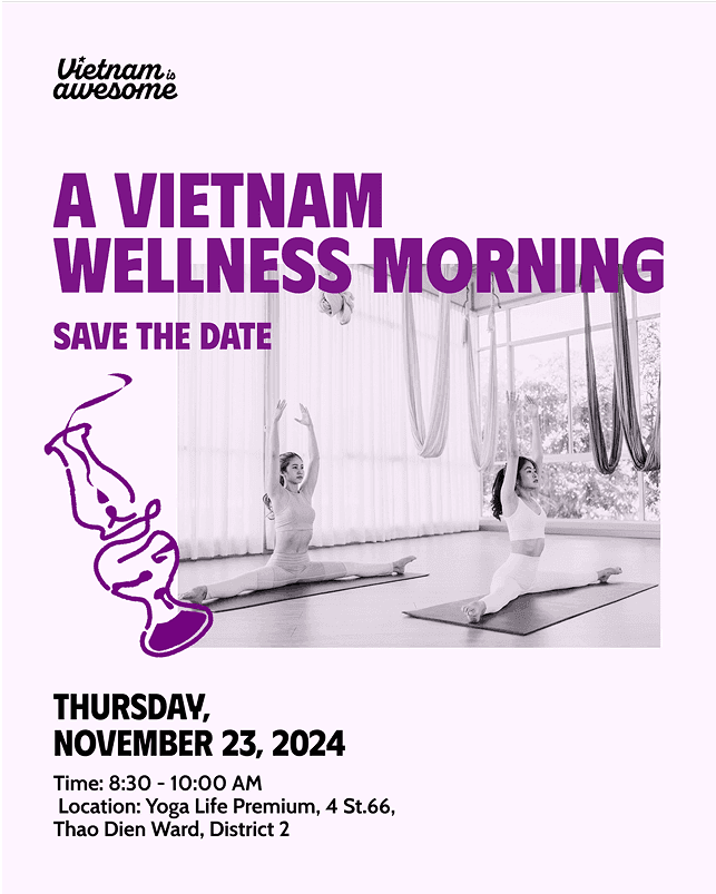
The colour theme for an application can be selected based on the specific context, mood, vibe, and sector.


Color Combinations To Avoid
Avoid using colour pairs with insufficient contrast, as they can cause discomfort and readability issues for the viewer.

