Typography
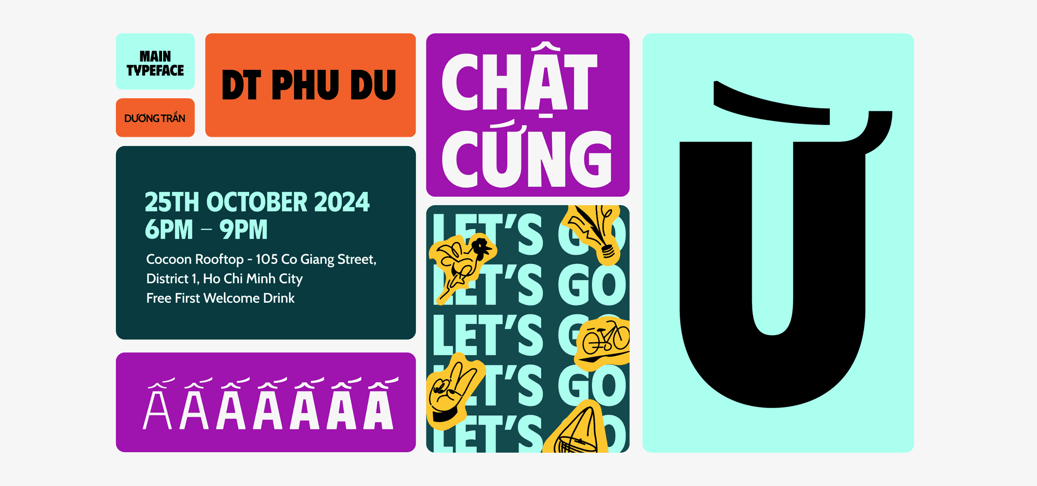
Brand Typeface
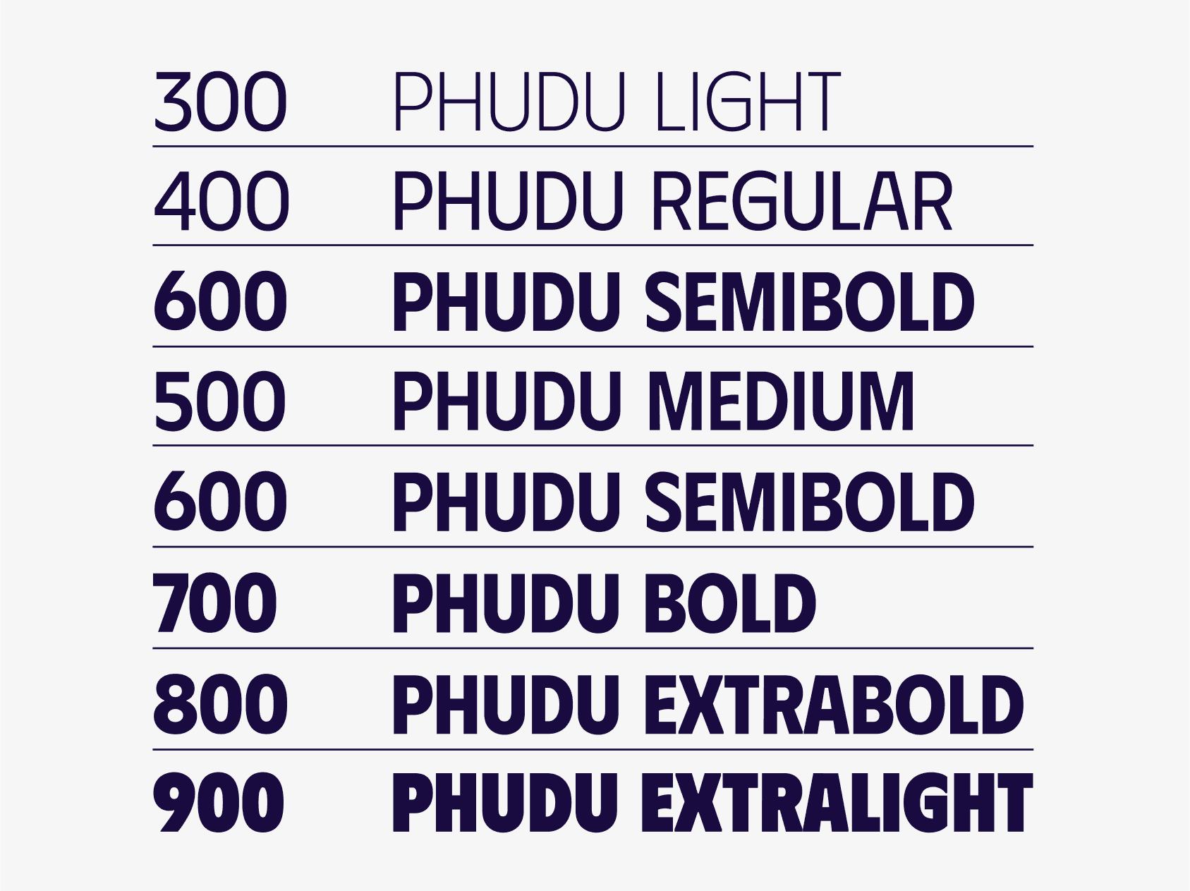
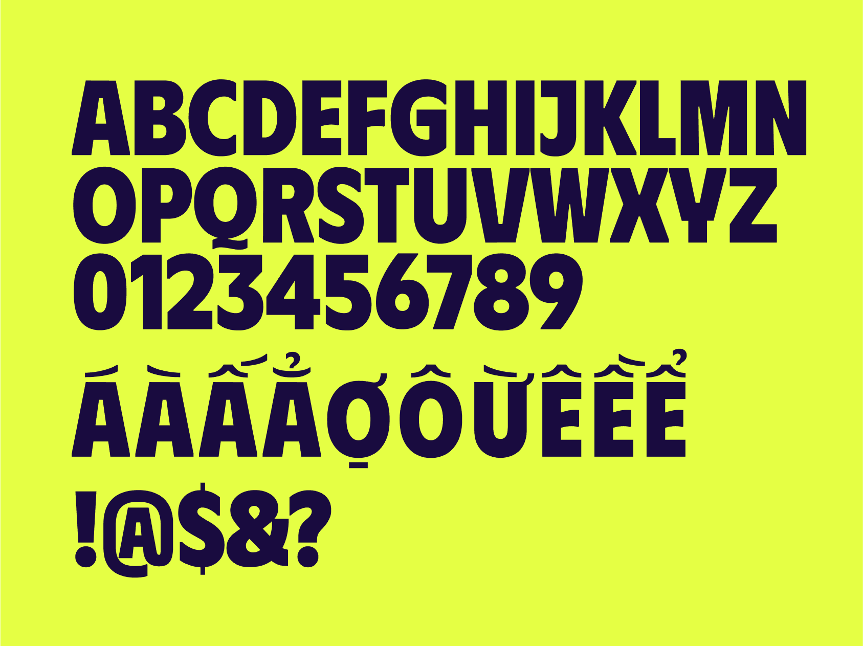
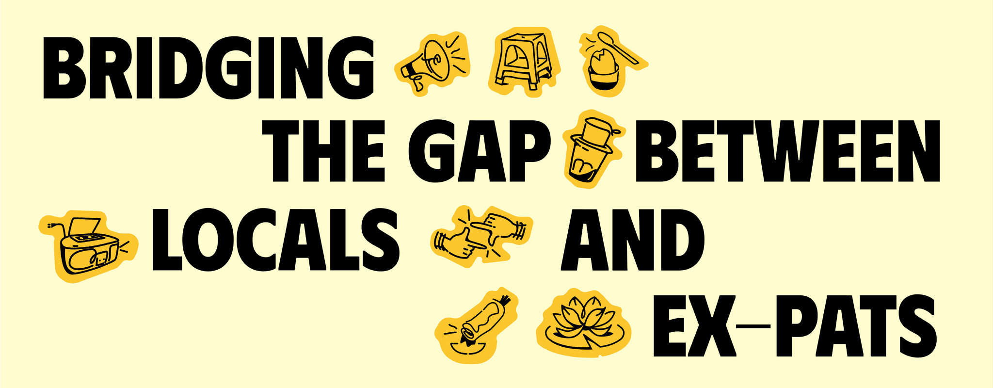
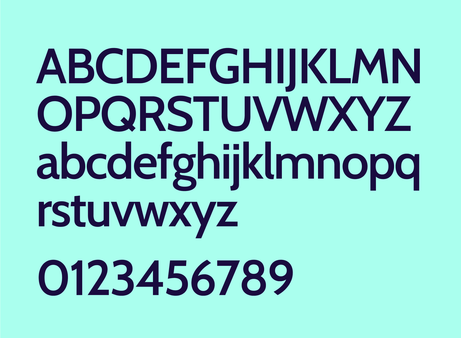
Phudu is a sans-serif display typeface inspired by Vietnamese hand-lettering billboards in the old days, that supports a wide range of languages by Duong Tran.
Secondary Typeface
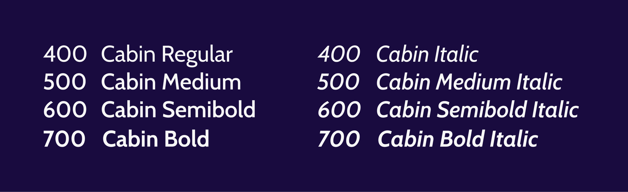
Cabin is a humanist sans inspired by Edward Johnston's and Eric Gill's typefaces, with a touch of modernism. Cabin incorporates modern proportions, optical adjustments, and some elements of the geometric sans. It remains true to its roots, but has its own personality.
Hierarchy
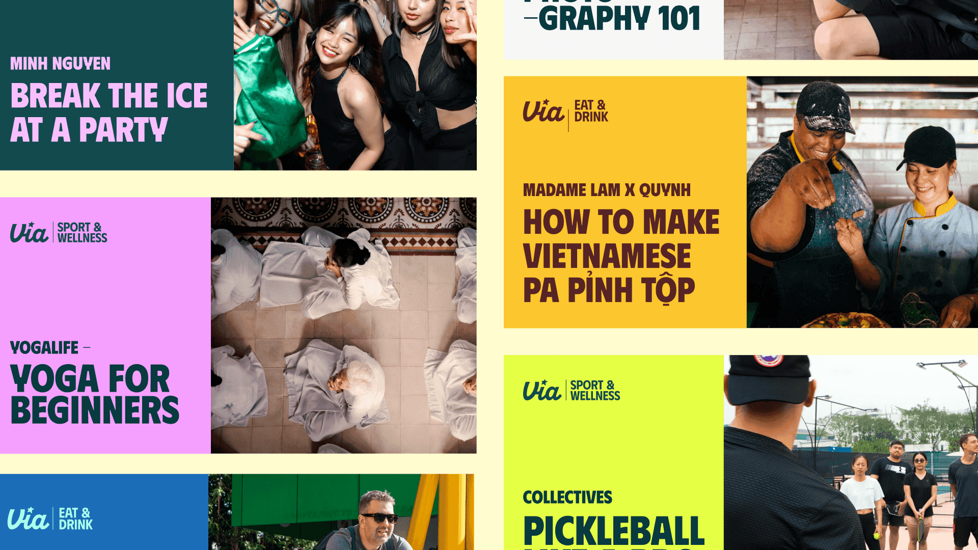
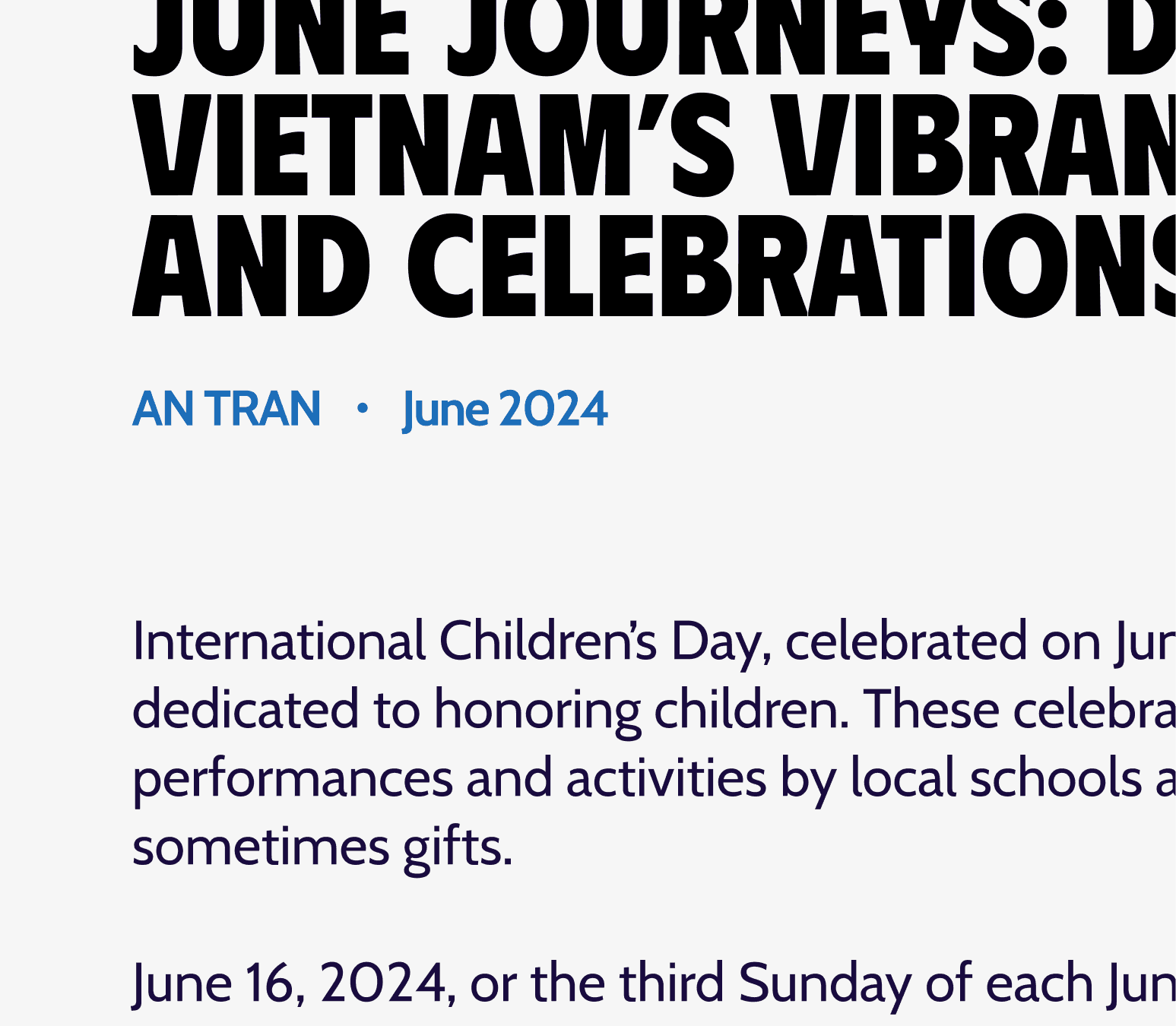
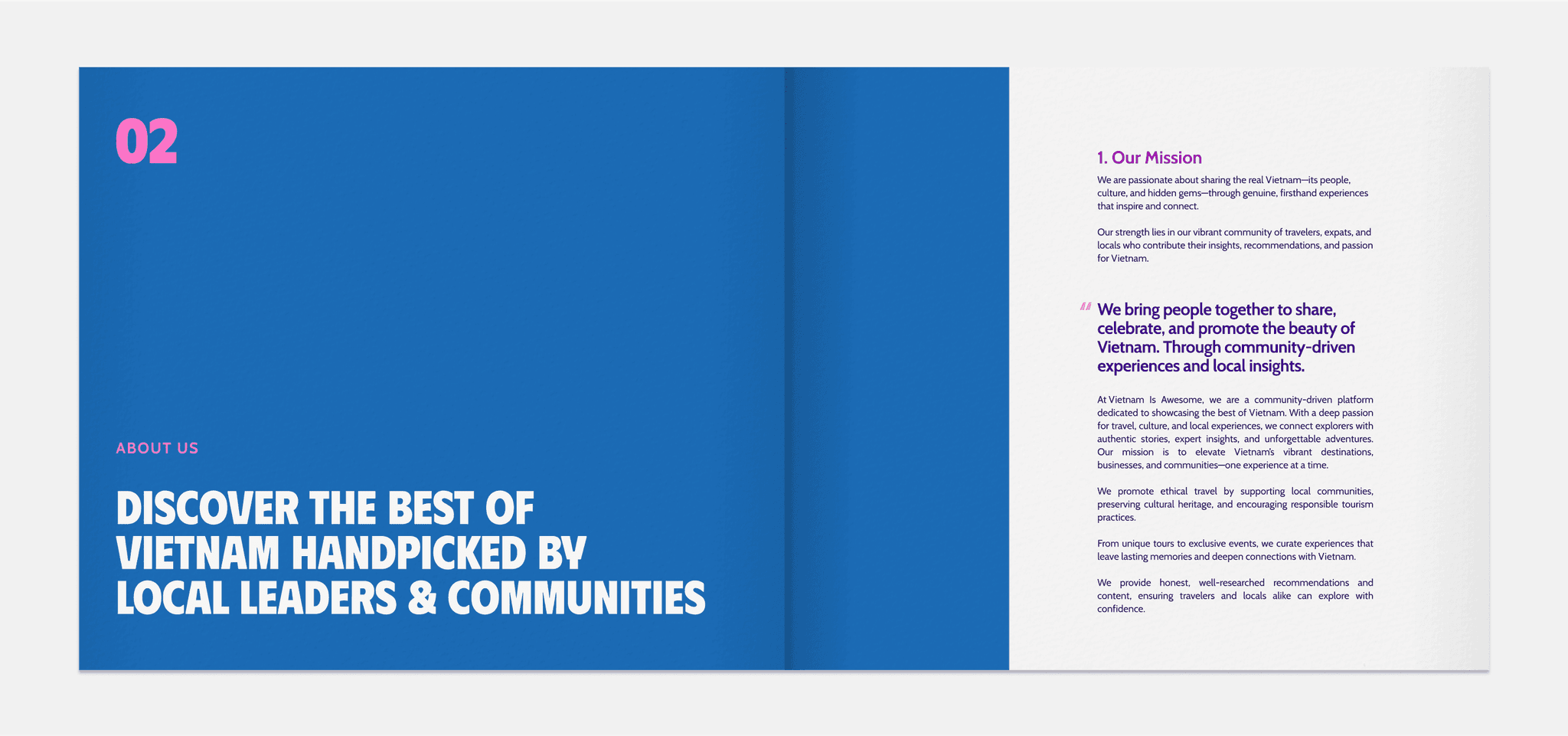
VIA's typographic system can be utilized in a more rigid and well-defined system – as described above. Bold headlines are combined with regular weights to create clear contrast and emphasize legibility and scanability.

Typesetting
Effective typesetting demands a keen eye for detail. To achieve consistency and excellent legibility, consider these universal principles when arranging type.
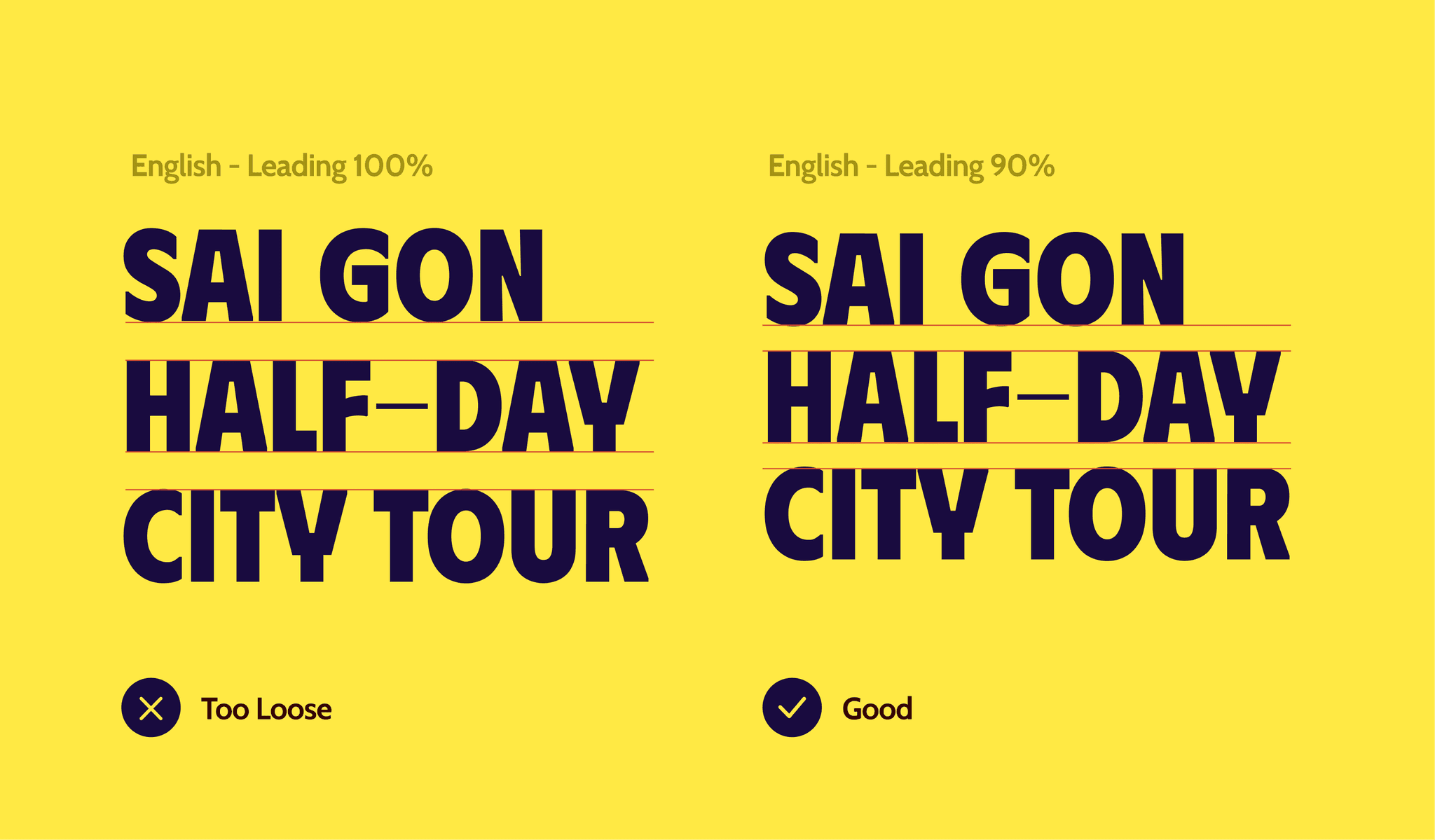
Ensure that line spacing is neither too tight nor too loose, as it can lead to poor aesthetics and readability issues.
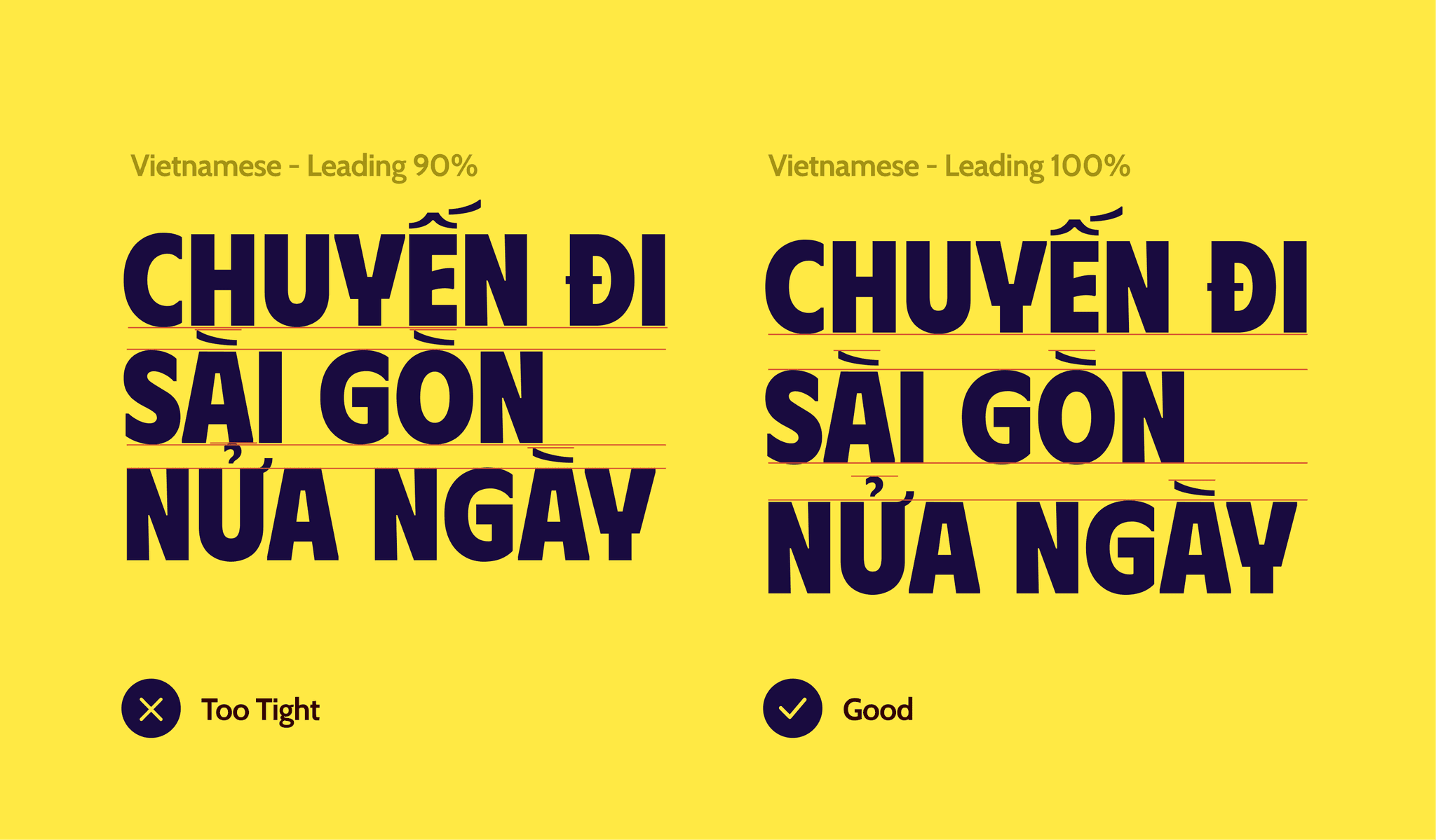
Ensure that line spacing is neither too tight nor too loose. Particularly for Vietnamese, line spacing should be wider than in English to accommodate the diacritics.
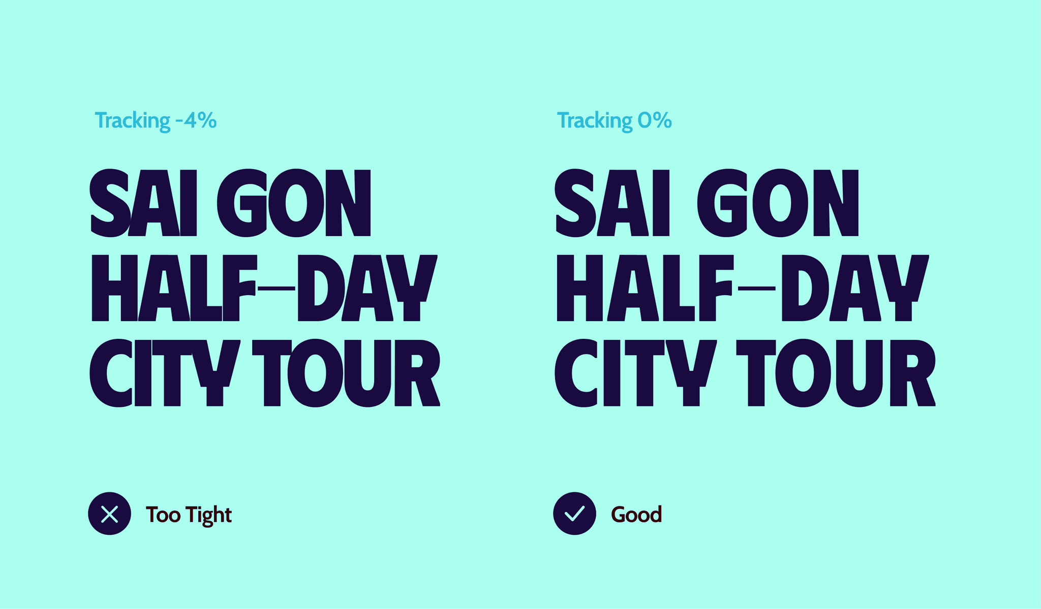
Ensure that letter tracking is not too tight or too loose, which could result in a lack of visual appeal and difficulty in reading.
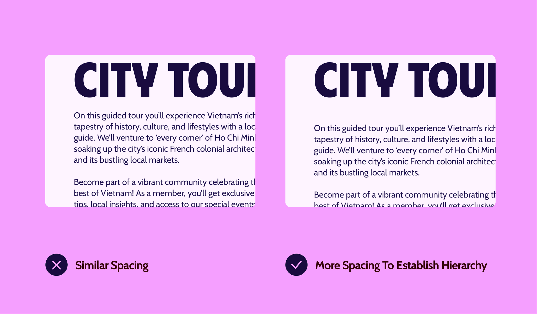
Ensure the spacing between the body text and the headline is greater than the spacing between paragraphs to create a clearer information hierarchy.
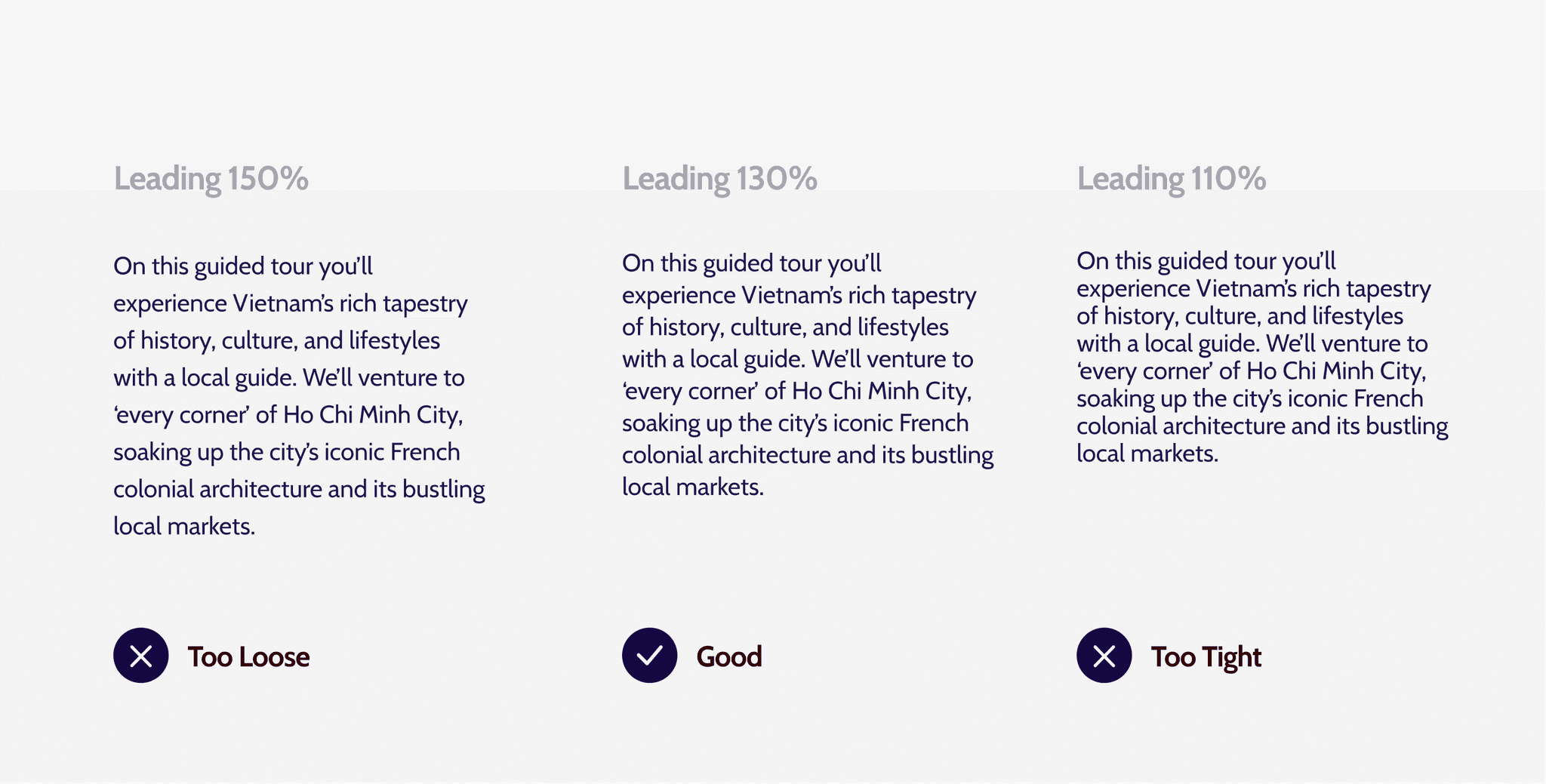
Ensure that the line spacing of body text is neither too tight nor too loose, as it can lead to poor aesthetics and readability issues.
Type In Use