Logo
The New Symbol of Vietnamese Community

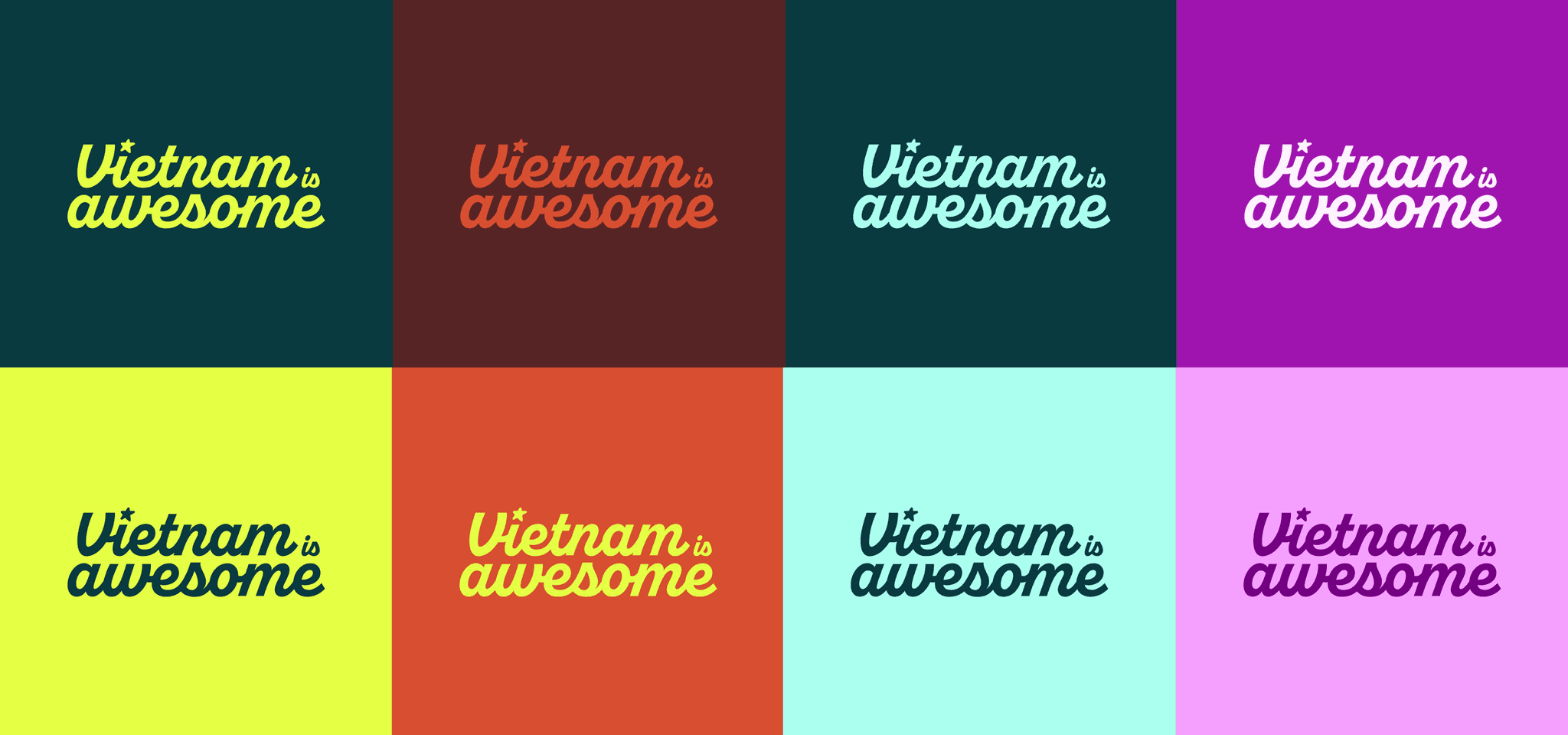
Two Lock-up
The brand name is displayed in a bold serif font with customized kerning to convey a classic, yet timeless editorial mindset. The logo can be presented in two versions: Primary (full name) and Secondary (initial).
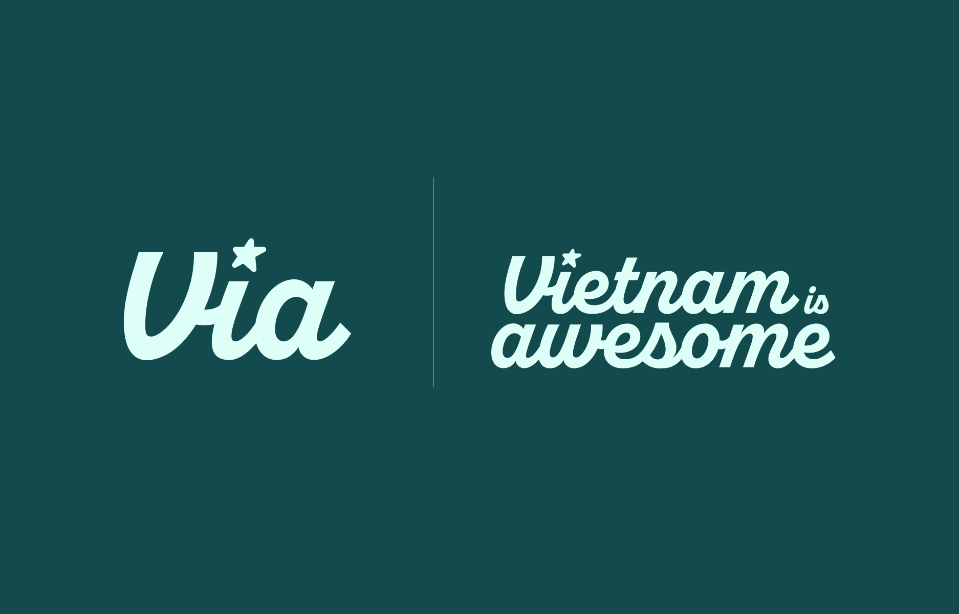
Intials Lock-up
The acronym VIA, which stands for Vietnam Is Awesome, is also the primary lock-up of the logo that is predominantly used in the brand's publications.
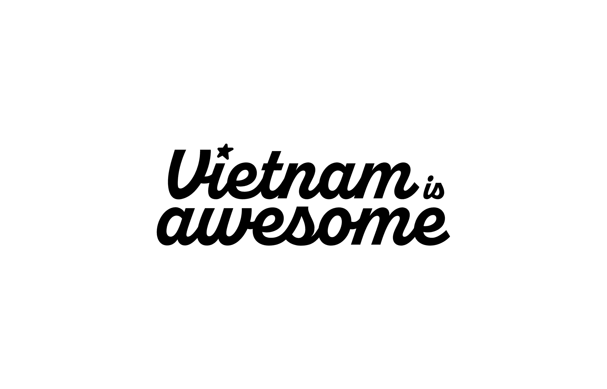
Full Lock-up
The full name of Vietnam Is Awesome should be used for applications and publications in events that require high recognizability.
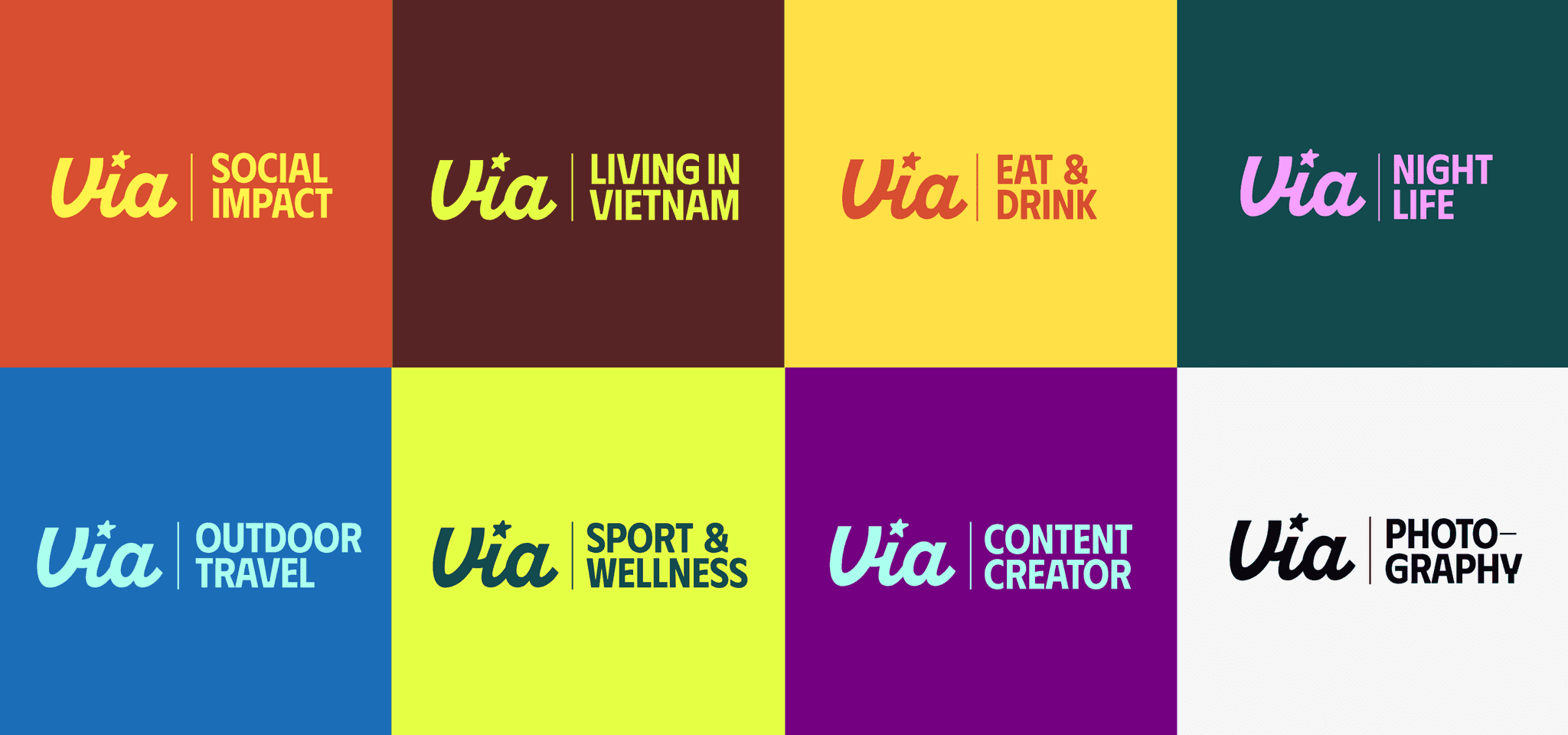
Sub-brand Logo
The initial logo of VIA can be flexibly used with the names of sub-brands, showcasing Vietnam Is Awesome through various activities and events.
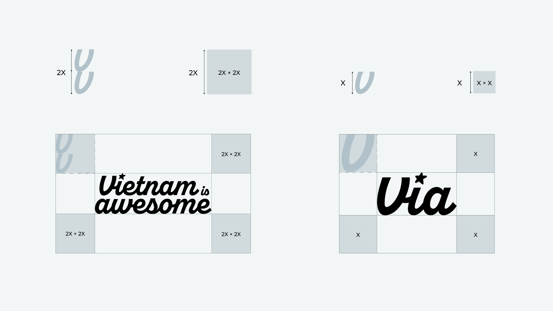
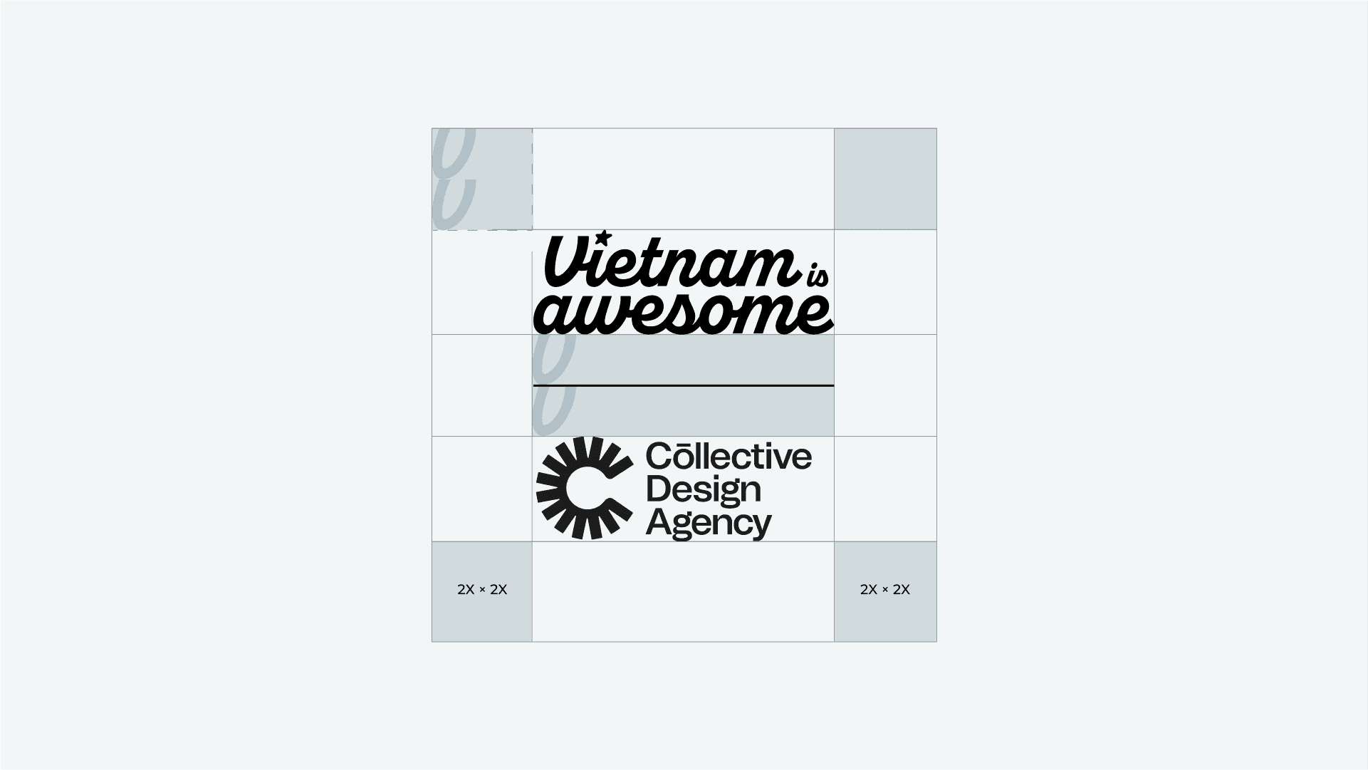
Clear Space
A square with a side length equal to 200% of the height of the "V" in the wordmark can be used to establish a clear space around the logo. This negative space enhances the logo's legibility by preventing overlap with busy backgrounds, elements, or text. Use your best judgment to ensure legibility consistently.
Margins to Edges
The logo also has an amount of margin that must be respected when placed near the edge of a digital or printed application. This is the minimum amount of distance between the logo and any edges of the application – which equates to the 200% height of the “V” mark.
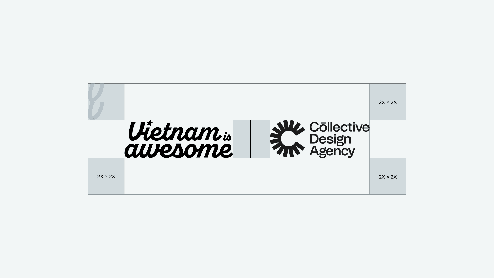
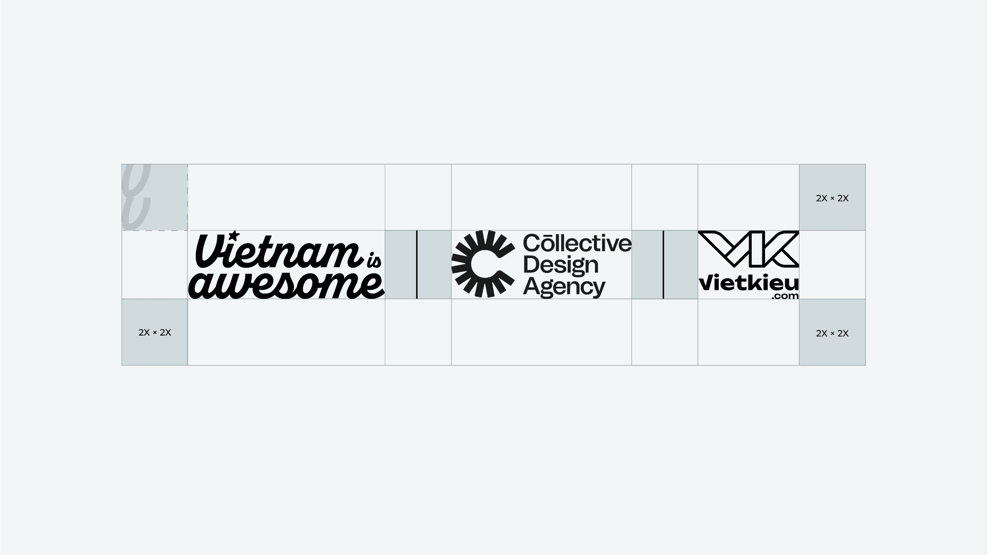
Logo & Partner
When used within the context of another brand logo / external partner document, make sure the logos are of equal height next to each other – with ample space between them.
The line between the two logos is optional. When using three or more logos, the rules regarding spacing and clear space around the logos still be maintained.
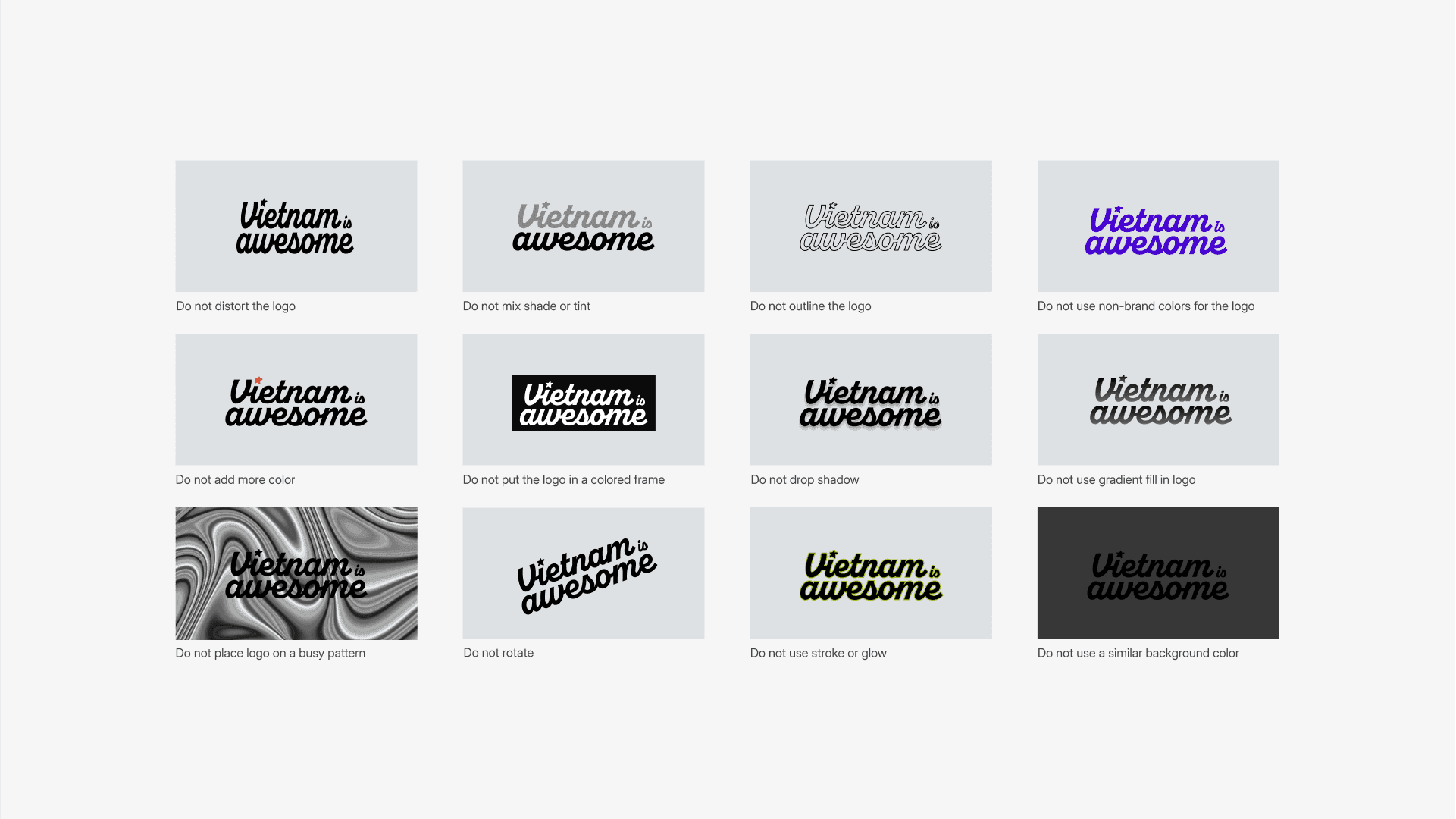
Logo Misuse
Here are some general guidelines in terms of what to not do when using Vietnam Is Awesome's logo. In general, do not distort the logo as provided and use your best judgment to ensure the brand's consistency.
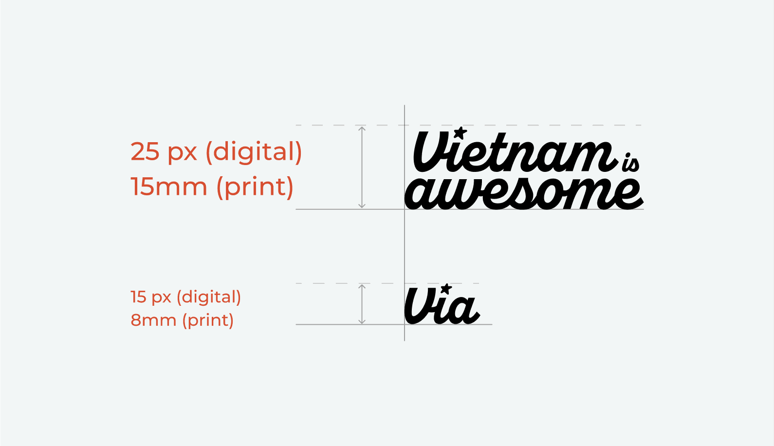
Minimum Sizes
The main logo has a minimum size indicated above for both printed and digital applications. For smaller applications, the initial version can be used instead. Use your best judgement to ensure the logo is always at the appropriate scale for legibility and prominent enough for the viewer.
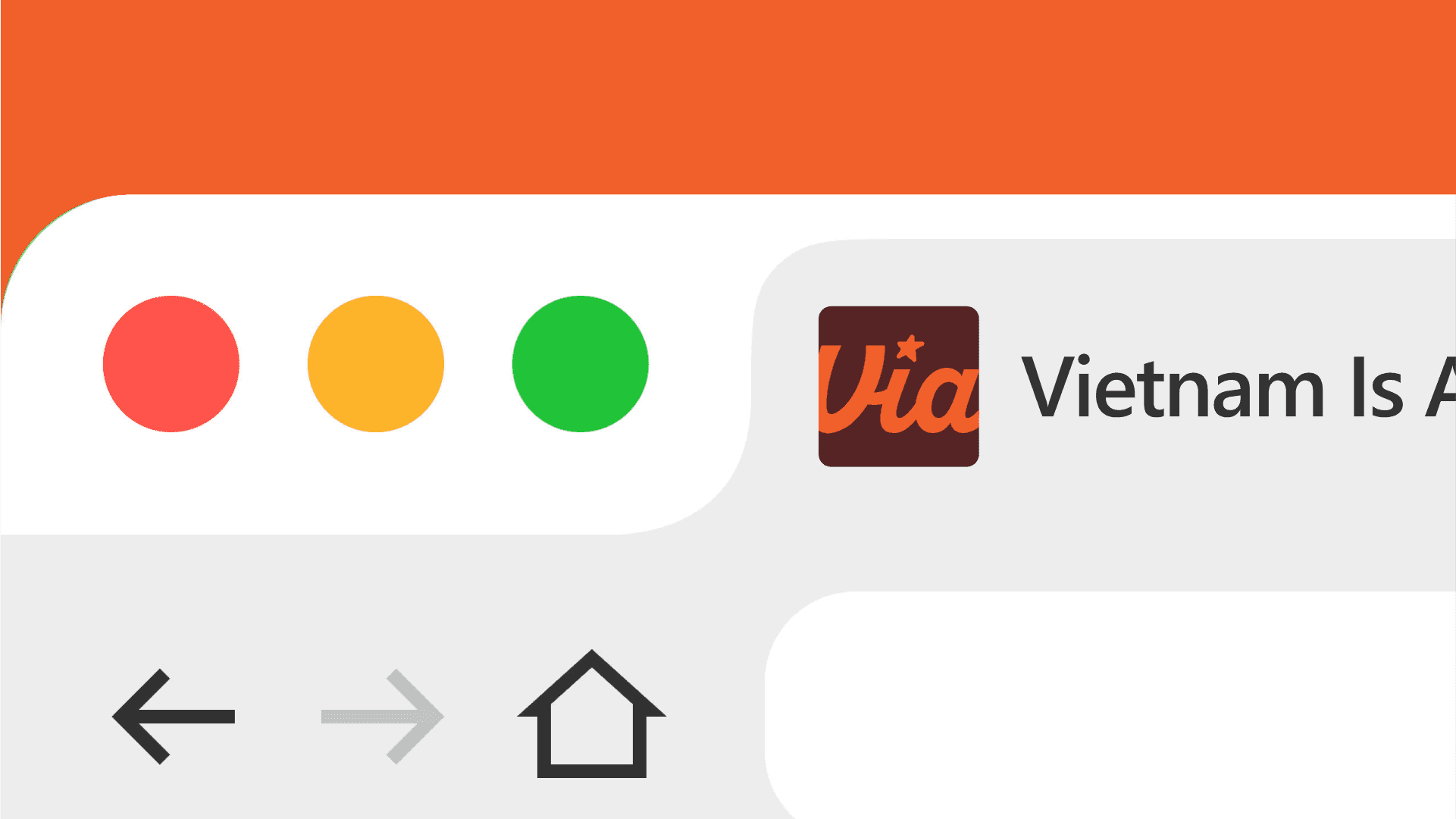
Favicon